


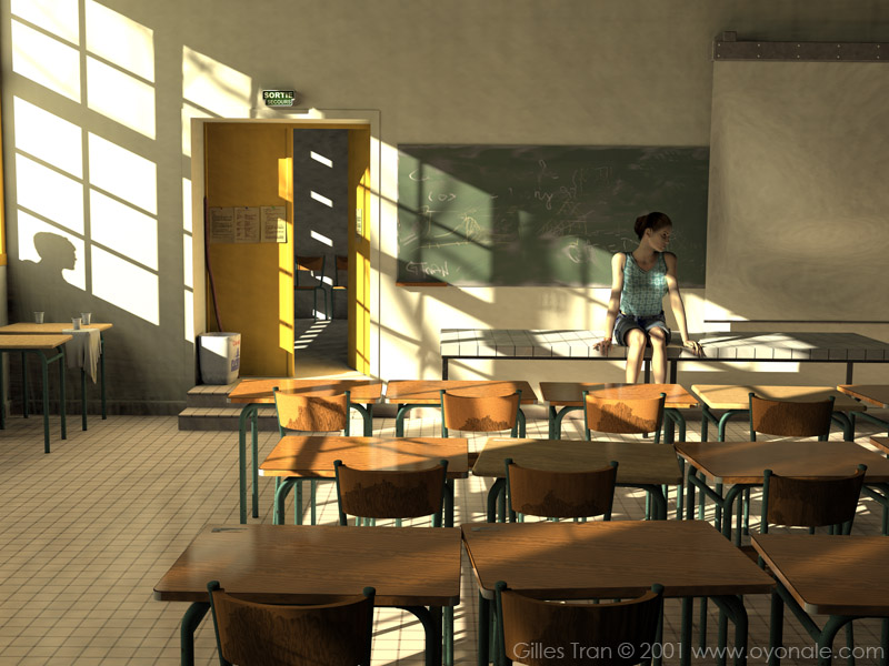
Artwork created in 2001
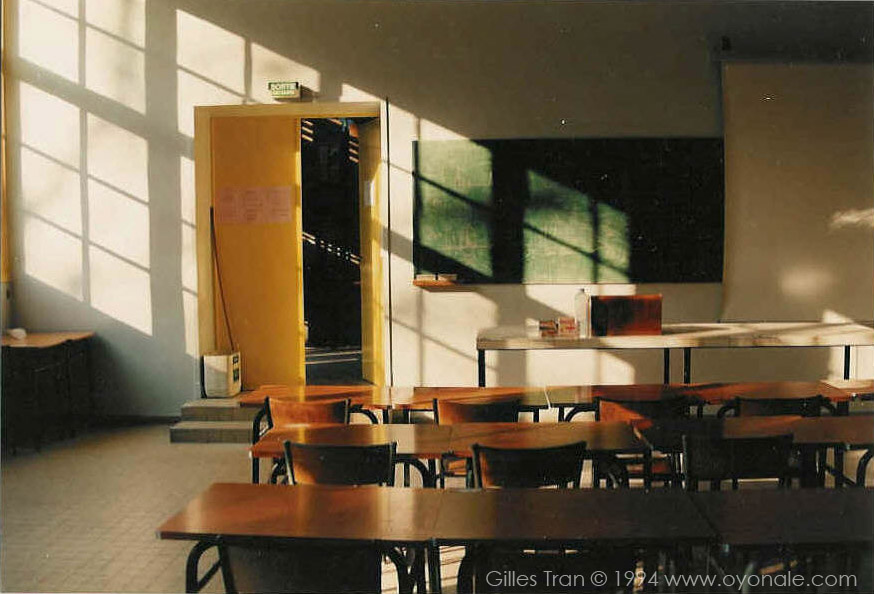
"The classroom" is supposed to be photorealistic. I say "is supposed to be", because its CG origin is quite obvious. Since the advent, in 2000-2001, of high-end renderers like Messiah or Brazil producing images that can truly be considered as "perfect" as far as photorealism goes, little Povray attempts like this one already appear outdated. Still, it's photorealistic enough to make less CG-savvy people say "oh, it looks like a photo" (while something in their mind will tell them the opposite). Here's the original photograph:
The 3D crowd, at large, loves the idea of computer-generated images so real that they can be taken for photographs. Of course, there's an industrial interest in this: by using cheap 100% photorealistic CG images instead of expensive real props, sets and extras, advertising companies and movie producers hope to save a lot of money. However, there's more to the fascination by photorealism than a lowly financial argument. In Western cultures (I can't tell for others) extreme realism have never failed to have people, artistic-minded or not, going oooh and aaah over man-made images that "looked real". Still-life deceptions ("trompe l'oeil") and other "dummy windows" have been a staple of popular entertainment since antiquity: according to Pliny the Elder, a Greek artist named Zeuxis created a painting of grapes that looked so real that birds started pecking at them.
The more recent hyperrealist/photorealist movement of the 60-70s can be debated from several perspectives: while a urban vista by Richard Estes may belong to a long tradition going back to Vermeer and beyond, other painters like Gerhard Richter have been more interested in the conceptual aspects implied by the reproduction of a photographic image, including the reproduction of its artefacts (focal or movement blur, for instance). By mimicking photographs, one could say that the artist questions his/her status as a creator, since neither the point of view nor the act of painting really belongs to him/her.
Still, conceptual reasons notwithstanding, people generally welcome photorealistic images with an innocent, childlike excitement. As a result, these images, even the most pointless of them, have maintained a remarkable popularity and overall marketability. Why do people enjoy them so much? I'll try a few answers. A much more educated discussion can be found here, by the way.
First, we admire virtuosity. It hints at craftsmanship, dedication to the task, hard work, years of training, buckets of sweat. In painting, music, finance or sports, we love the person who can do what we mere mortals can't. However, virtuosity is not always easy to spot without the proper references. In painting, the level of accuracy in the representation of reality is one easy measurement of one peculiar sort of virtuosity that everyone can appreciate by comparing the imitation to the original. My grandmother never acknowledged the genious of Picasso, but she would surely have commented the images above.
Second, we see the ability of the artist in representing reality as a measurement of his/her understanding of the world. There's something god-like in the capacity of a human being to depict in a credible way the complexity of what he/she sees and experiences. The real thing may be nice, but a lifelike copy of it is even better. Of the millions of people who have paid to see Dustin Hoffman play an autistic person in Rain Man, few would pay to see a documentary about autism.
Third, we like to have our senses tricked and deceived. It's fun, it's a game, it's exciting.
Needless to say, virtuosity has nothing to do with art: it's just one of the paths that may lead to the artistic achievement. Out of tune singers can be overwhelmingly more moving than virtuosos. The representation of reality doesn't have to be photographic to be accurate. There's no necessity for a representation to be accurate at all. There's no absolute requirement to represent reality. And what is reality anyway, if not a trick of the senses, as every Matrix spectator knows? What we call "realistic" is often an imitation of an idealised version of the original: how can we say that the dinosaurs in Jurassic Park are realistic since nobody ever saw a living one?
This sort of cheap philosophy could go on and on, so I sum up its main consequence: from an artistic point of view, photorealism without a point of view is of no interest whatsoever. And when photorealistic CG pictures become so banal that we take them for granted, the fascination is likely to wear off quickly. But I could be wrong. After all, pornographic or violent images void of anything else than their own pornography or violence keep being fascinating.
"The wet bird" won the IRTC March-April 2000 round. It has been hotly debated, first when it was submitted (people thought that it was a photograph and complained about it to the IRTC admins - I still don't understand any of this) and since then in couple of forums. The pros and cons boil down to the following:
Pros: "It's a great picture because it looks like a photo. It really fooled me."
Cons: "It's dumb. If the guy wanted to make a realistic image of New York, why didn't he just go to New York with a camera." Or "Anybody could do the same with Photoshop."
This is a little bit disappointing, of course. If people retained only the "photoreal" aspect of this image it means that I've failed at making it interesting in other ways. That its composition, organisation, meaning etc. were lost on many viewers, appreciative or not. That it lacks the point of view I was talking about. Something that would not have happened if the picture had not been photorealistic!
Still, some photorealistic trickery was necessary for this image, as it was for The classroom. How does this happen?
It started as an "angel" image. Not that I believe in angels, or even appreciate the pagan pseudo-religious glurge that go with them. But angels, as mythical, cross-cultural and versatile fantasy creatures are certainly interesting, and one the most touching rendition of angels is Wim Wenders' movie "Wings of desire" (Der Himmel über Berlin, 1986).
The initial concept was about two characters in a dimly lit room: a seated woman in a red dress, and a man in a dark suit standing behind her, slightly on her side, close but not touching her. Both characters would face us. Their bodies would be visible, but their heads would be lost in darkness. The man - the angel - wouldn't have wings. Its angelic nature would be given by his gentle, protective stance, or by the title if that wasn't obvious enough.
It wasn't supposed to be a realistic image. The room would be bare, with no furniture but the chair for the woman. There wouldn't be a visible light source, such as a lamp. It was to look like a theatre stage. It seemed pretty simple at first.
So I fired up Poser and quickly posed, exported and converted the woman and the man, simple figures that I would use as quick placeholders until I'd replace them by the more detailed Vicky and Mickey from DAZ. I created the textures and went to work on the stage, in fact a few boxes put together. It was obvious that a good part of the lighting would rely on radiosity. After a few hours of work, version 3 looked like this:
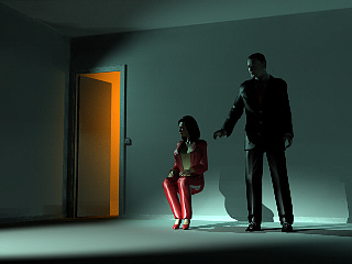
It was a good start but had its share of problems. As you can see, the woman wears pants, not a dress. This is because it's a simple Poser 4 model, but, as I was to replace this model by Victoria, I remembered that Vicky's wardrobe didn't include a dress or skirt that is long enough to cover the knees and able to fold nicely when the character is seated. The available clothes included a mini-skirt and a long non-folding dress: none of them fitted the idea. There was also the question of finding a proper business suit for Mickey, as his wardrobe didn't include one at this time. Well, there was a lot of work to be done before I got to finding clothes for the characters.
The main problem, as expected, was the lighting. In the test image above, the effect is there (the faces are left in the dark) but it looks like they are watching TV, or facing a spotlight (which is the case). I couldn't get a diffuse, soft light that would just stop at their heads. I tested many different positions, intensities and fading distances for the spotlight. I also tried different image ratios. Nothing gave what I wanted.
The back room proved itself tricky too. This room was necessary to add a further dimension to the image. There's nothing like an open door to stir the viewer's imagination. Angels come in many shapes: this could be a fallen one. The orange glow was there to create a contrast between the blue, soothing, comforting and somewhat chilly atmosphere of the main room and the tempting wilderness on the other side of the door. Eventually, I couldn't find any colour combination and contrast between colour intensities that looked right. Something seemed always awkward, no matter what I did. So I called it off, and tried something else, as can be seen in version 8:
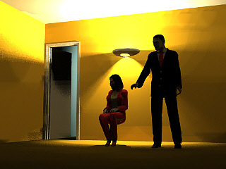
Notice how the image is more realistic. It's less theatrical, more like a real room. The contrast is inverted, and now the characters are darker, and are illuminated by radiosity only. It was far from satisfactory, however. Though the yellow room is better than the blue in the previous tests, the red dress (or pants) seems out of place due to the lack of contrast. And if I dressed the woman in black, she would look like a widow. In white, the radiosity would turn her yellow. Also, the indirect lighting would make it necessary to use some heavy duty area light, that would form a compound deadly for rendering time when used with radiosity. So, after some further pointless tinkering, I pulled the plug for the second time. But I was not running out of ideas, as can be seen in version 9:
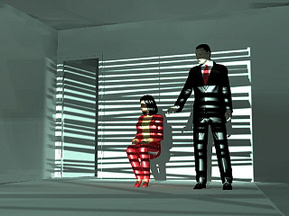
The slat effect is interesting, no more. It's quite different from the initial concept. There's too much light and one cannot help wondering what sort of slats are these... some sort of overdone private-eye office. Fantasy is all right, realism is all right, but awkward realism is a sure miss. With the clothing problem still unsolved, I had to ditch the project altogether.
This aborted attempt made me think of a series of photographs I had taken at my workplace some years ago. These were moody images of empty classrooms and corridors, and I remembered particularly the image seen at the beginning of this text, which shows a now disappeared classroom. Though not a great image by any means, but this photograph, I realised, could be the ideal setting for a revised "angel" project. It would require some adaptations though.
First, I would downplay the angel angle. If the place was a realistic classroom, it meant a younger girl. Having a man reaching for her would have a totally different meaning, certainly less angelic. I had to reduce the man's presence to a mere minimum to play it safe. The girl herself would be more realistic, so I could happily forget about the red dress. Finally, it could be a great way to test Megapov's radiosity ability to mimic a photograph.
Once under way, the new project went smoothly. Using a reference image frees the mind from many questions. I derived the objects' dimensions from the picture (I later measured them directly) and started modeling the classroom. Very quickly, I obtained the following image (version 1a):
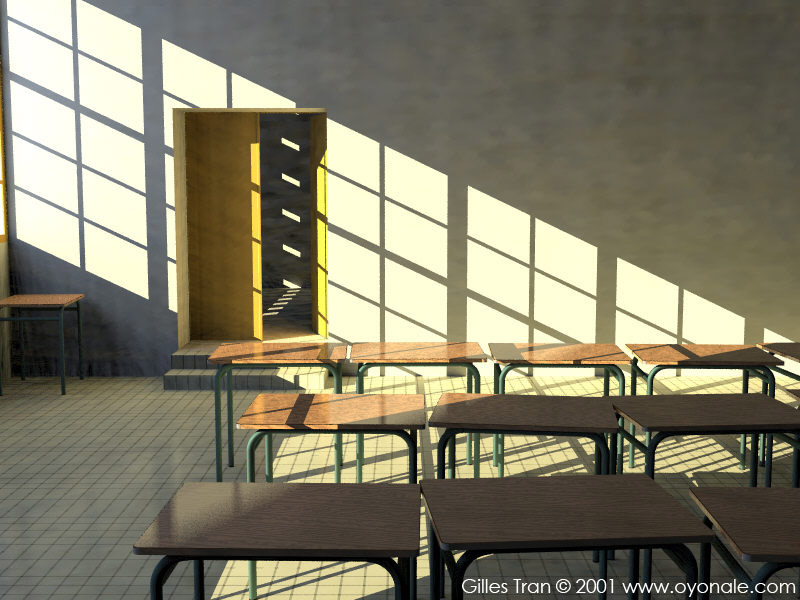
After that, it was just a matter of tweaking the light and radiosity settings to obtained something close to the photograph, and modeling and texturing what was required in the scene. Version 4 shows a thoughtful naked girl:
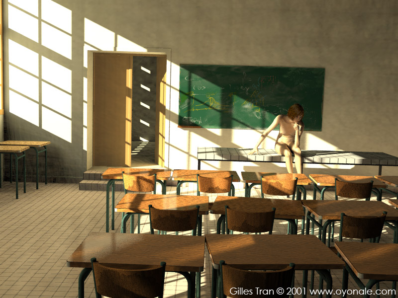
Version 5 has a near-final Victoria with proper clothes but the wrong hair and version 8 shows an almost definitive setup with most of the props already there. Note how the door becomes more saturated: I had to cheat with the colour, by exponentiating its components by 1.8.
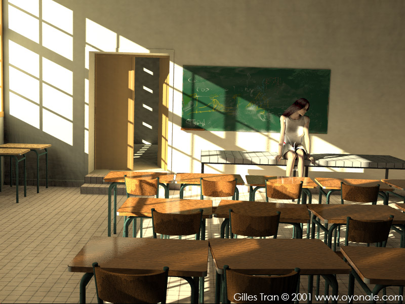
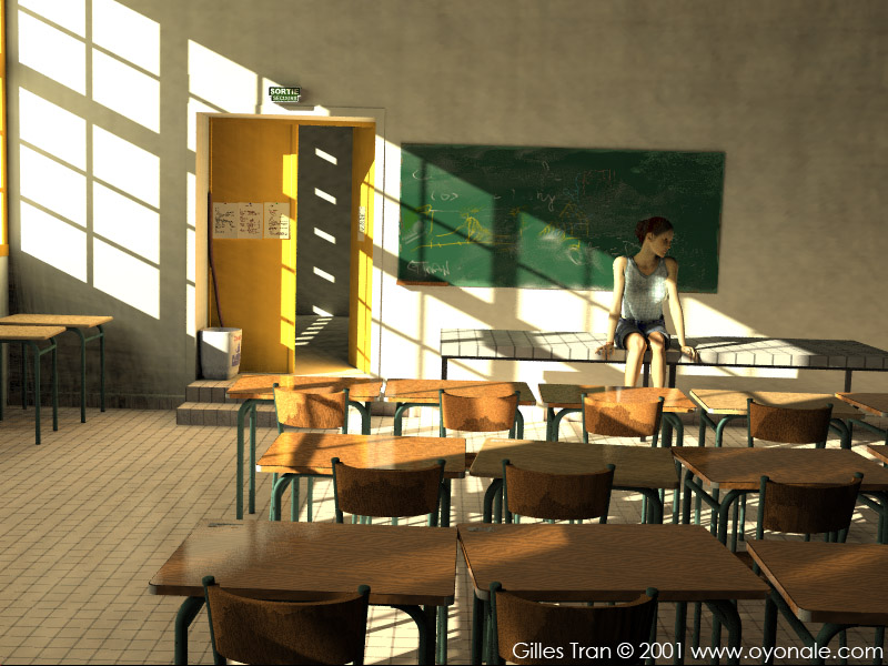
The props were modelled after real-life objects. It's mostly CSG and procedural textures (table, chair, broom), plus some modeling with sPatch (the dust bin, the screen, the plastic cups) and some height fields (the exit sign, the torn labels on the table). The blackboard texture was painted in Painter Classic, big enough to fit a 3200 x 2400 render. Blurred reflection was used on the ground and on the tables. The rag (which is uv-mapped) was made with Christophe Bouffartigue's clothray patch available in POVMan.
The tree shadow was obtained by rendering a black and white tree (the one used in First lights). The tree image was then blurred and an alpha channel was added. The final image was then positioned where the real tree is. Click on the tree image below to download the final transparency map (0.8 Mb, PNG format, 1860 x 2600 pixels):
There should have been a water bottle: I spent some time modeling it, but its single refracting presence put the whole image in jeopardy, as it made the rendering time totally unacceptable. Rule : avoid putting refracting objects in a radiosity scene that uses high settings.
I also did a test with photon mapping (see the reflections on the screen in the photograph). The test gave surprisingly accurate results given the incertitude in exact geometry, positioning and texturing of the objects involved. However, for speed reasons, I had to give up the reflective ceramic tiling for the table that gave the reflective caustics.
The girl is Victoria, with hair by Kozaburo and a T-shirt from the Victoria Clothes Pack. She also wears a bracelet from a jewelry collection by Anton Kisiel (Renderosity). The shorts are actually Michael's: they don't fit her but fortunately it's not very noticeable. The skin texture is rendered using the skin shader available in Povman. This shader models the variation of reflection in the skin layers. Thanks to Vahur Krouverk for providing a Povray solution to the skin texturing. The angel's head, only seen as a shadow, is a Poser 4 head with hair.
One problem was not solved: radiosity artefacts. I used the rather extreme radiosity parameters below:
radiosity{
pretrace_start 1
pretrace_end 1
count 1600 error_bound 0.02
nearest_count 4
recursion_limit 1
low_error_factor 1
gray_threshold 0
minimum_reuse 0.015
brightness 2
adc_bailout 0.01/2
normal on
}
Still, I couldn't get rid of radiosity splotches on the walls. This is, I guess, a limitation in the current implementation of radiosity in Megapov and Povray 3.5. The only workaround known is to avoid having smooth, bland surfaces (see "The call of the wild" for an application of this principle).
The final image took 10 days or so to render at 3200 x 2400. I didn't smooth out the radiosity artefacts. However, I did remove by gaussian blur the graininess due to the area light artefacts. I also fixed an unhealthy bony knee and some other usual problems with close-ups of Poser models translated to Povray.